
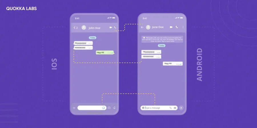
It is fascinating to recognize the visual distinction between Android and iOS applications to understand user behavior and interaction better. Before kicking off your project, you must determine your target audience and platform to proceed with design and development. However, your app UI UX design is the foundation for successfully developing highly engaging and intuitive mobile apps. Hiring a professional mobile app development company in Dallas will help you describe how iOS and Android app design can majorly impact your development process and why you must understand both platform guidelines.
Every tiny element, such as buttons, iconography, and content placement, significantly impacts user familiarity with the app design. Android and iOS app design revolve around a deep understanding of user behavior to optimize navigation and enhance the overall mobile experience. In this article, you will discover the minute-to-major differences between iOS and Android app designs, directly impacting user experience.
An Overview For Material Design Vs. Human Interface Design
If you hear these terminologies for the first time, let us describe them so you can understand the basics. Material design refers to the Android app design guidelines, whereas Human Interface design refers to iOS app design guidelines. These guidelines are the roadmap for UI/UX designers, providing extensive knowledge about the user experience of both platforms. For instance, an Android app development agency typically follows these material design guidelines to create user-focused, visually appealing apps for Android devices.
Android Material Design – In order to build user-focused and visually appealing Android apps, UI/UX designers follow the guidelines in the material design specification for Android devices. This Android material design was introduced by Google in 2004 for uniformity in user experience with substantial skeuomorphism elements to ensure familiarity with flat design simplicity. There are three key principles, including:
- Metamorphic nature
- Bold graphic design
- Purposeful Animation
- Adaptive Design
Human Interface Guidelines (HIG) – iOS guidelines and practices emphasize clarity and intuitive user experience across all Apple devices, including specific recommendations for navigation, typography, accessibility, and system components within an app. For HIG, the key principles are:
- Clarity
- Deference
- Depth
However, both design systems focus on intuitive, responsive, and user-friendly UI/UX design, but they take different approaches. The material design incorporates shadow and bold graphics to differentiate elements, whereas HIGH emphasizes clarity and minimalist aesthetics.
Key App Design Differences Between iOS and Android
Top-Of-Screen Navigation
In Android, titles are typically left aligned with action items on the side of the top of the navigation bar. In iOS, titles are centered and aligned with action items on the right side of the navigation bar.
Navigation Pattern
To properly navigate users, Android uses a Hamburger menu on the primary screen, which looks explicitly like a three-horizontal line element for a cleaner and space-free visual. For secondary navigation, Android uses a navigation drawer to access additional features.
iOS design focuses on the tab bar menu at the bottom of the primary screen, which provides instant access with one click. Similarly, the secondary navigation uses nested views or additional tabs to ensure maximum feature adjustment.
Back Navigation
Android users typically use a bottom physical and on-screen button to go to the previous screen or back navigation. Keeping this in mind, designers include this familiarity within the app to navigate users to the back. Similarly, iOS users mainly navigate to the back screen from the left side of the top corner or support swipe gestures.
Visual Elements in App Design
The Material design guidelines focus on clarity and consistent design in visual elements, including iconography concerning diverse screen resolutions. To fit the screen resolution, Android guidelines prefer customizable and scalable icons. Developers can use different sizes of icons to fit into all Android devices easily. Similarly, Apple also has diverse devices with a range of updated versions. All required highly customizable, clear, and minimalistic aesthetics to differentiate numerous functionalities, especially on Retina display.
Typography Preferences
Use the Roboto font style for Android apps to deliver a clean, readable experience, allowing users to digest given information easily. On the other hand, the iOS app development should use the San Francisco font style to provide a coherent look and extensive content visibility across all Apple devices.
Let’s Wrap It Up
Understanding these differences is crucial when designing an app, as it ensures that your design choices align with the user expectations and navigation behaviors specific to each platform. Whether you are designing for Android with its fluid, adaptable interfaces or iOS with its refined, consistency-focused approach, embracing each platform’s unique design principles will ultimately enhance usability, engagement, and user satisfaction. For developers and designers, respecting platform-specific guidelines optimizes performance and creates a more enjoyable and efficient experience for the end user. Focusing on customized design will help you build high-performing and intuitive mobile apps that attract and engage users. If you want to develop an iOS or Android app, you can hire an iOS and Android app development agency to build professional-looking mobile applications with exquisite design.