
Designing a website that’s easy to use isn’t just about looking good it’s about helping visitors find what they want quickly and easily. When your website is user-friendly, people stick around longer and are more likely to take action, like making a purchase or signing up.
In this guide, we’ll break down simple steps to create a website that feels natural to visitors and drives more conversions. From understanding your audience to crafting clear calls to action, you’ll learn how to make your site both inviting and effective.
Understand Your Audience and Their Needs
Before you start designing your website, it’s crucial to understand your audience and their needs. A user-friendly website that converts well speaks directly to the people who visit it.
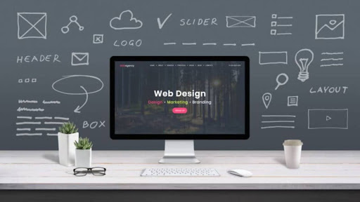
Working with a skilled web design agency can help you identify your visitors and create a site that feels personal and useful to them.
Why Knowing Your Audience Matters
If you don’t know who you’re designing for, your website might confuse visitors or fail to solve their problems. Understanding your audience helps you make smart choices about design, content, and features. For example, a website aimed at teenagers will look and work differently from one made for busy professionals. When you focus on your users, they feel like the website was built just for them, which encourages them to stay longer and take action.
Creating User Personas
One of the best ways to understand your audience is by creating user personas. These are simple profiles that describe your typical visitors, including their age, job, interests, and what problems they want to solve. User personas help you picture who you’re talking to when designing your website. This makes your design choices clear and focused.
Identifying User Goals
Every visitor comes to your website with a goal; maybe to buy a product, find information, or sign up for a newsletter. Knowing these goals lets you guide visitors smoothly toward completing actions that benefit both them and your business. Ask yourself what your audience needs most and make those things easy to find.
Keep the Design Clean and Simple
When it comes to designing a user-friendly website for optimal conversions, keeping the design clean and simple is a game changer. A cluttered or confusing website can overwhelm visitors and push them away before they even explore your content.
Why Simple Design Works
A clean design means fewer distractions. When your website looks neat and organized, visitors can easily find important information and buttons. This makes their experience smooth and enjoyable. Plus, simple designs load faster, which keeps users happy and reduces the chance they’ll leave your site.
Clear Navigation is Key
One of the most important parts of a clean design is clear navigation. Your menu should be easy to spot and understand. Use straightforward labels like “Home,” “Products,” or “Contact” so visitors know exactly where to click. Avoid overwhelming them with too many options; stick to the essentials.
Consistent Colors and Fonts
Choose a simple color scheme that matches your brand, and stick with it across all pages. Too many colors can make your site look messy and confusing. The same goes for fonts; use one or two easy-to-read fonts throughout your website. Consistency helps your site look professional and makes it easier for visitors to focus on your message.
Prioritize What Matters Most
Put your most important content and calls to action where visitors can see them right away. Don’t fill pages with unnecessary images or text. Every element on your site should serve a purpose and guide users toward converting.
Optimize Website Speed and Mobile Responsiveness
When designing a user-friendly website for optimal conversions, two factors play a huge role: website speed and mobile responsiveness. Visitors expect your site to load quickly and work perfectly on any device. If it doesn’t, they’re likely to leave and never come back.
Why Website Speed Matters
People have little patience for slow websites. If your pages take too long to load, visitors get frustrated and click away. Even a few extra seconds can cost you sales or sign-ups. Fast-loading sites keep users engaged and improve your chances of turning visits into conversions.
How to Improve Speed
You can boost your site’s speed by compressing images, using clean code, and choosing a reliable hosting service. Avoid heavy animations or large files that slow things down. Tools like Google PageSpeed Insights help you test and fix speed issues easily.
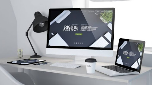
The Power of Mobile Responsiveness
More than half of all web traffic comes from mobile devices like phones and tablets. That means your site must look good and work well on smaller screens. A mobile-responsive website automatically adjusts its layout to fit any device, making it easy for visitors to browse and take action.
Testing Mobile Friendliness
Make sure buttons are easy to tap, text is readable without zooming, and menus are simple to use on mobile devices. You can use tools like Google’s Mobile-Friendly Test to check how your site performs on phones and tablets.
Use Clear Calls to Action (CTAs)
A key part of designing a user-friendly website for optimal conversions is using clear calls to action, or CTAs. CTAs are the buttons or links that tell visitors what to do next, like “Buy Now,” “Sign Up,” or “Learn More.” Without strong CTAs, even the best website can fail to turn visitors into customers.
Why Clear CTAs Are Important
Clear CTAs guide your visitors through your site and help them complete important actions. When people know exactly what step to take next, they are more likely to follow through. Confusing or hidden CTAs can leave visitors unsure and cause them to leave without converting.
Place CTAs Where Visitors Look
Put your CTAs where people naturally focus their attention; usually near the top of the page, at the end of important content, or in the website’s main navigation. Make sure they stand out by using a color that contrasts with the rest of your design.
Use Simple and Actionable Language
Use short, direct words that tell visitors what they will get by clicking. For example, “Get Your Free Trial” or “Download Now.” Avoid vague phrases like “Click Here” because they don’t explain the benefit.
Test and Improve Your CTAs
Try different wording, colors, and placements to see what works best. A/B testing lets you compare different CTAs to find the ones that get the most clicks and conversions.
Conclusion
Creating a user-friendly website is key to turning visitors into customers. By focusing on clean design, fast speed, and clear CTAs, you set the stage for optimal conversions. Follow these tips to design a website that people love to use and that helps grow your business.